Overwatch's Season 1 Menu Rebuild Puts Heroes in the Lobby
A redesigned front end moved the selected hero into a 3D lobby and reorganized play cards, navigation, social tools, and notifications.
At a glance
- Main change
- 3D selected-hero lobby
- Also rebuilt
- Play, social, notifications
The front end became a character space
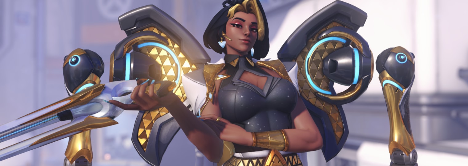
Season 1 replaced the familiar static flow with a lobby that displays the player's selected hero in 3D. That decision made cosmetic choices visible between matches and gave the home screen a stronger connection to the roster.
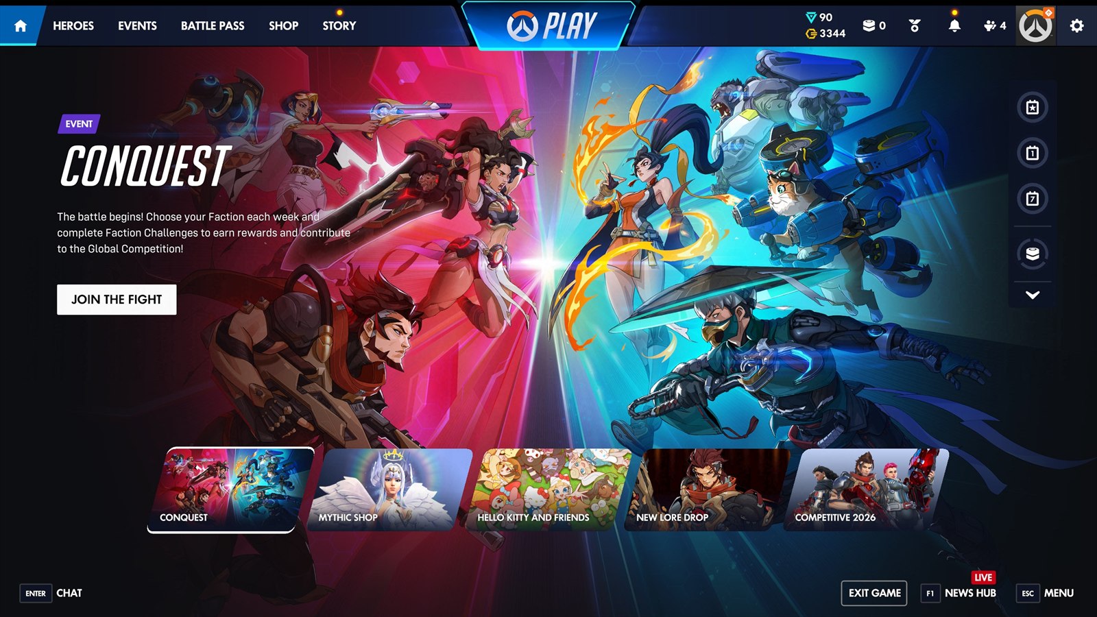
Play cards and primary navigation were reorganized around the same update. Frequently used destinations were meant to require less hunting, while the hero presentation supplied motion without turning the screen into a promotional carousel.
Social and notification tools moved with it
The rebuild included a revised social panel and a notification hub, centralizing invitations and account activity that had previously competed with other menus. Blizzard also discussed expanding the lobby to show every group member in a later season.
Interface changes can be easy to overlook beside five new heroes, but this one affected every session. Before a player selected a mode or entered the practice range, the new lobby established how the reorganized version of Overwatch expected to be navigated.